Perfecting Your Labels: 3 Tips for Designing
There are many factors that have to work in harmony in order to create the perfect product. Of course, the quality of the actual product matters the most, but it’s also essential to make the product visually appealing enough for the consumers to actually purchase it in the first place. That’s one of the major reasons why the packaging industry has experienced a boom over the past decade.
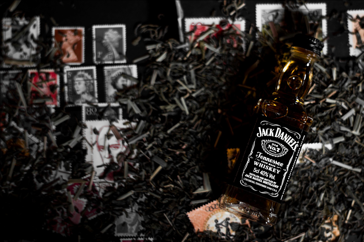
However, a critical component that’s often overlooked when evaluating the factors that influence the success of a product is label design. A recent study revealed that an eye-catching label is a key factor that drives consumer behavior and builds customer loyalty.
That’s why manufacturers are now spending large sums of money on screen printing glass bottles, amber glass jars, and other such containers.
In this blog, we’ll discuss three major tips that will help you create the perfect label for your brand.
Be clear and concise
A fundamental characteristic of any great product label is that it doesn’t have any fluff—it’s clear and concise, and understands the value of space. As you have limited space to work with, it’s important that you don’t include any information on the label that the consumer could do without.
Make sure the copywriting is creative enough to capture the imagination of the consumer while still providing them with relevant information such as the ingredients of the product and how it should be used.
Use colors effectively
Even the most brilliantly designed product label will fail to grab the attention of consumers if the right colors aren’t used. When designing a product label, the designer should understand that they have a very small time-frame in which they need to grab the consumer’s attention.
That doesn’t necessarily mean that you only have to use vibrant colors, even if they don’t complement the overall theme of your brand, but it does mean that you have to find a color scheme that makes your product stand out. Avoid color clashes and opt for complementary colors that reflect the brand’s personality.

Select the right font
The designer must be given strict instructions to select the font of the product label carefully. The kind of font you should use varies according to the industry. Companies that have a fun brand personality should never select a font that’s as common as Times New Roman, as that would show the consumer that very little thought has gone into designing the label.
With millions of fonts available online, it’s not that hard to find a font that’s fun but also easily readable. In cases where the brand personality revolves around durability, you’re encouraged to use a bold fond as that’s mostly associated with longevity.
Once you’ve designed the right font for your brand and wish to get it printed from a reliable company, reach out to us at Premium Vials. We offer label printing services on anything from clear glass jars to square glass bottles. For more information, contact us today!
Recent Posts
-

Why Should You Choose Amber Glass When Packaging Beauty Products?
Designing a line of beauty products is no simple task. So many details go into planning and crafting …7th Jul 2022 -

Candle Supplies - The Benefits of Using Tins for Your Candle Business
Candle business is a fantastic way to turn a hobby into an extra income stream. For those willing an …7th Jul 2022 -

Customize your packaging and protect your products during shipping
Customize your packaging and protect your products during shipping. Our custom partitions are made i …5th Jul 2022